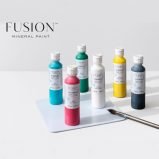
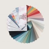
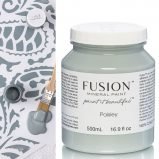
Paint
Fusion Paint is a water-based, zero VOC paint that’s easy to use, environmentally friendly and provides a durable finish. Use it on furniture, walls, doors and more!
Showing 1–2 of 76 results
-

Fusion For Kids (1)
-
Fusion Metallic Paint (7)
-
Fusion Milk Paint (1)
-
Fusion Mineral Paint (66)
-
Limited Release (4)
-
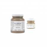
Algonquin Fusion Mineral Paint
$8.99 – $29.99 Select options This product has multiple variants. The options may be chosen on the product page -
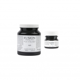
Ash Fusion Mineral Paint
$8.99 – $29.99 Select options This product has multiple variants. The options may be chosen on the product page